Header image

Blog

Painting During Lockdown


I’m always on the lookout for willing life models, and being stuck at home during lockdown with grownup children returning from their cancelled lives was too good an opportunity to miss. I decided weeks ago to try and use this strange time to make a painting about family, the complete absence of social distancing going on at the moment with everyone at home, and of my four children as separate individuals but also as one fantastic friendship unit. They have had an extended Mahjong game going on in our kitchen during lockdown that I’ve been drawing, and I’ve now started to make a large painting of the four of them. Here are some progress shots:


Starting on the tabletop, mahjong tiles and faces

Posted in Uncategorized | Leave a comment

Zoe Frank and the Portinari Altarpiece


One of the treats of lockdown for me has been taking the amazing Zoey Frank’s Multifigure Composition Workshop. She has given nearly two hundred painters from around the world a marvellous series of talks every Friday for the last month on how she approaches composition via zoom, quite a feat! Each week we have been set gouache study homework to encourage more analytical thinking about composition. Last week I chose Hugo Van Der Goes’ Portinari Altarpiece as its such an ambitious painting in terms of time and scale, nearly 50 figures in all in the painting and most of the story of the birth of Jesus is portrayed in the painting in one form or another. I’ve always loved the work for its slightly off kilter quality, the strange architecture, the weird discontinuities in space and scale, the slightly cut and paste nature of the composition, and of course all the hidden monsters.

What I learnt in doing this study is that the picture is far more tightly planned and organized than I had expected. The weirdness and finally observed details obscure the marvelous large forms that make up the painting’s armature: from the left panel the great diagonal dark block that leads you up and into the centre right of the central panel, turning on the angel hovering in the sky who directs you down through the earth coloured Shepherd grouping into the airy right panel full of elegant ladies and saints. Just as the dark areas are punctuated by bright highlights: hands, faces, the lighter areas have offsetting areas of deep rich darks. Both sides of the painting have wonderful bursts of primary colour here and there, particularly gorgeous to me is the gaggle of small sparkly angels in the right foreground. The Portinaris had seven children and only three are painted in the side panels, I wonder whether some of the others are hidden amongst all those small angels. They seem just as real as the huge earthy shepherds bursting into the stable above them.

Meanwhile in the middle distance all the chapters of Jesus’s birth are detailed, from the left Mary and Joseph and the donkey on the way to Bethlehem, Elizabeth and Mary chatting at the gate, the angel announcing the birth of Jesus to the Shepherds on a distant hill, and the Three Wise Men with their entourage arriving from their long journey top right. And in the middle of it all an empty space with a small smudge of gold that is all too easy to miss and that all the fuss is about.

A few years after the painting was finished it was transported from Flanders back to Florence by the Portinari Family. It took several weeks by sea down the Atlantic coast of Spain and through the western Mediterranean and came into Florence up the Arno. When it arrived the entire city ground to a halt to watch the procession of this giant painting to its new home. The Florentines had never seen anything like it before, its cool northern light and realistic portrayal of ordinary people so different from the idealized versions of the world that the Italians were making at the time. For a long time the Altarpiece dominated the Botticelli Room in the Uffizi, hung on the opposite wall to Botticelli’s Birth Of Venus, two utterly different world views expressed in paint. A few years ago it was moved into the Northern Renaissance Room and replaced by Botticelli’s Annunciation Fresco, another extraordinary work. Whilst it is fantastic to be able to get to know a new Botticelli I do miss being able to see the North and the South worlds of the 1480s in one enormous room.


Posted in Uncategorized | Leave a comment

Pierre Bonnard and Migrations

Tate Modern’s Pierre Bonnard Exhibition, the Colour of Memory has been one of my high points of the last year. Some much loved old favourites like his Bol Du Lait were on show, but there was one new painting I kept returning to that I just couldn’t get out of my head, his Venus De Cyrene. It is named after the book that is lying on the tabletop, but it is more about the vase of flowers and the overall space than the book. Like many of Bonnard’s paintings its spatial cues are ambiguous: are we looking down at a carpet beyond the tabletop or at a view through a balcony window on the left? What is that strange orange object top right? Is that a small figure pushing a pram on the street below or a figure in the carpet pattern just above the rim of the vase?

I found this spatial ambiguity and the strange colour relationships absolutely compelling, and in the end I decided to use it as a staring point for a painting of my own. It developed in slightly unexpected directions following various summer conversations on Bonnard, moving house across continents and bird migrations. The painting now lives in the house of old friends in San Fransisco so has been on quite a journey of its own.

Venus De Cyrene by Bonnard:


The Start of my painting Migrations:


My finished painting:


Posted in Uncategorized | Leave a comment

Why I Draw

I took part in a panel discussion on contemporary drawing other day with fellow NEAC painters Paul Newland, Toby Ward and Ben Hughes on why we draw, below is an edited version of my talk:

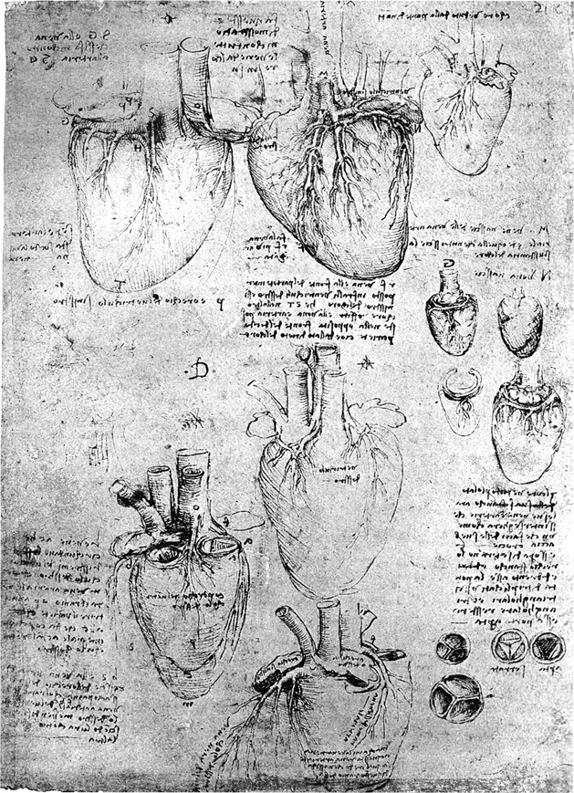
A while ago Andrew Graham Dixon gave a robust argument for drawing skills on Radio 4’s Start The Week: He told the story of a famous heart surgeon who insisted that his students draw the structure of the heart ventricles from life in the dissection room to get to grips with the overall make up of the heart. In the surgeon’s view no amount of passive looking would enable an understanding as thorough as the challenge of having to explain the heart’s three dimensional structure in two dimensions.

Here is Leonardo Da Vinci’s drawing of a human heart which demonstrates Andrew’s point perfectly..


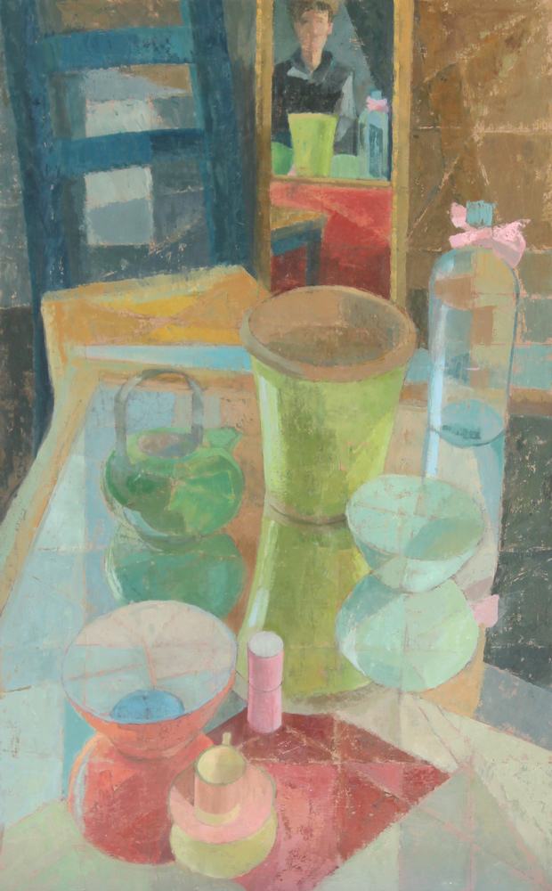
Some painters manage to think directly in paint, but drawing is how I get to understand what I see and is fundamental to making my paintings. I think of my work as a two stage process, the empirical, observational part that takes place through drawing when I start to discover a new subject, and the synthetic compositional part that happens later on in the studio armed with my paint brush, often collaging together different drawing elements.

This slide of a large landscape painting I did last year shows this progression: I spent a couple of days drawing on the side of a rather windswept hill down in Dorset, jotting down colour notes and light direction to give me an idea of ground and palette I wanted to capture the autumnal air, and the spectacular late afternoon stormy skies that happened on the first day.


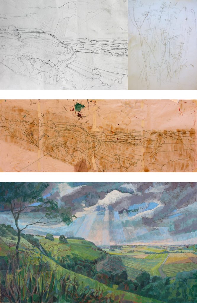
When I got back to the studio I made scaled up cartoons from the drawings and transferred them to a large board and started to paint. By this stage I know the palette I’m going to use based on the light conditions, weather and atmosphere I want to capture. Its always a limited palette but can vary enormously according to the requirements of the subject. With this painting I used a pretty deep intense set of colours to capture the brooding skies and heavy atmosphere: Indian Red, Viridian Green, Cereleum Blue Deep, Yellow Ochre and Lemon Yellow. Later on I returned outdoors for some hedgerow detail which was added into the foreground once I had worked out the overall composition.

My drawing priorities are capturing a sense of the space I’m thinking about, usually bending perspective rules a little, using instead relative scale, shapes, internal structure, tone, the fall of light and overall composition of a subject. If I have grasped these qualities I can get started on a painting back in the studio armed with my drawings. As my work is about creating space and light with colour I’m not particularly interested in surface texture and small detail, so these tend to go unremarked on whilst drawing.

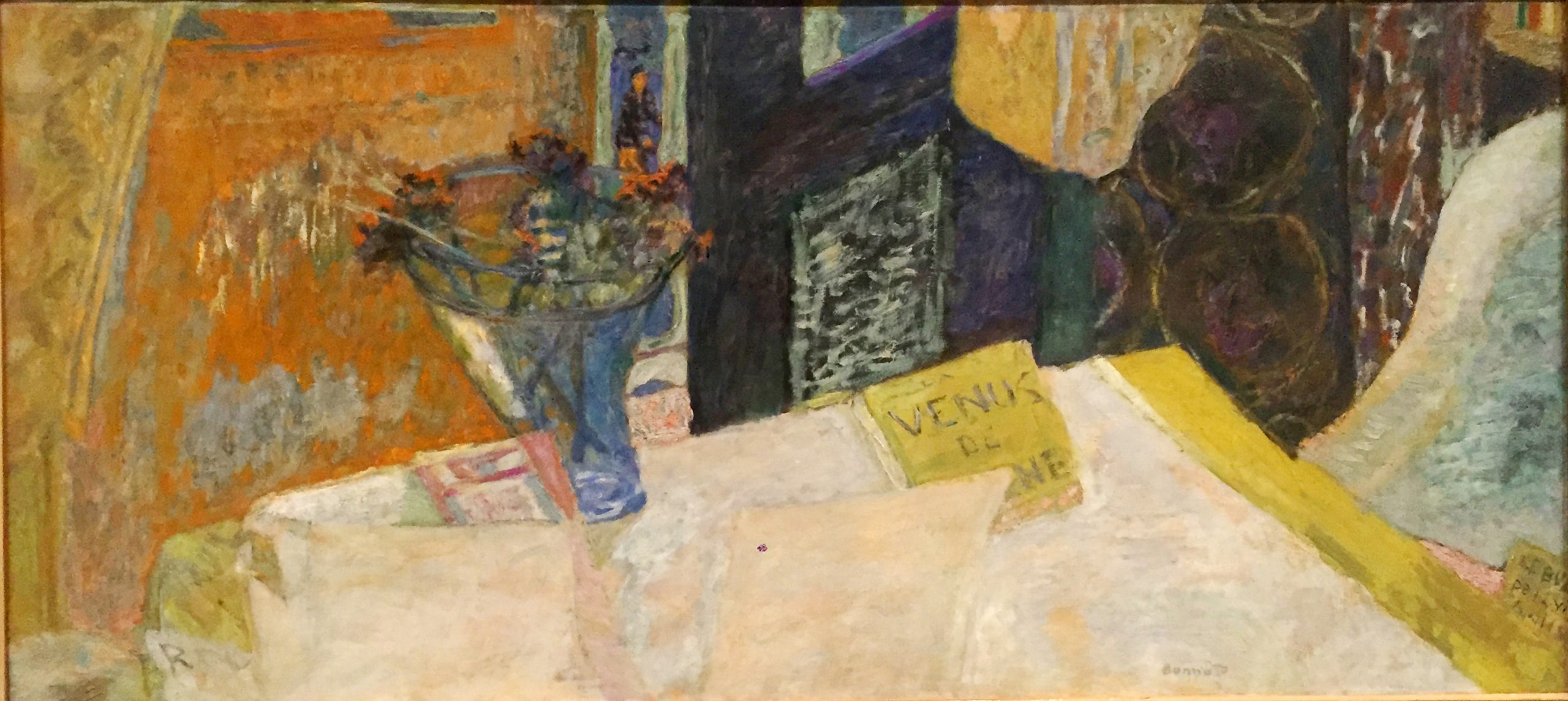
Often my subject matter presents itself because of unusual and compelling colour relationships and shapes. That’s the missing piece of the compositional jigsaw in drawing, but I can capture a lot of colour ideas by carefully studying tonal relationships.

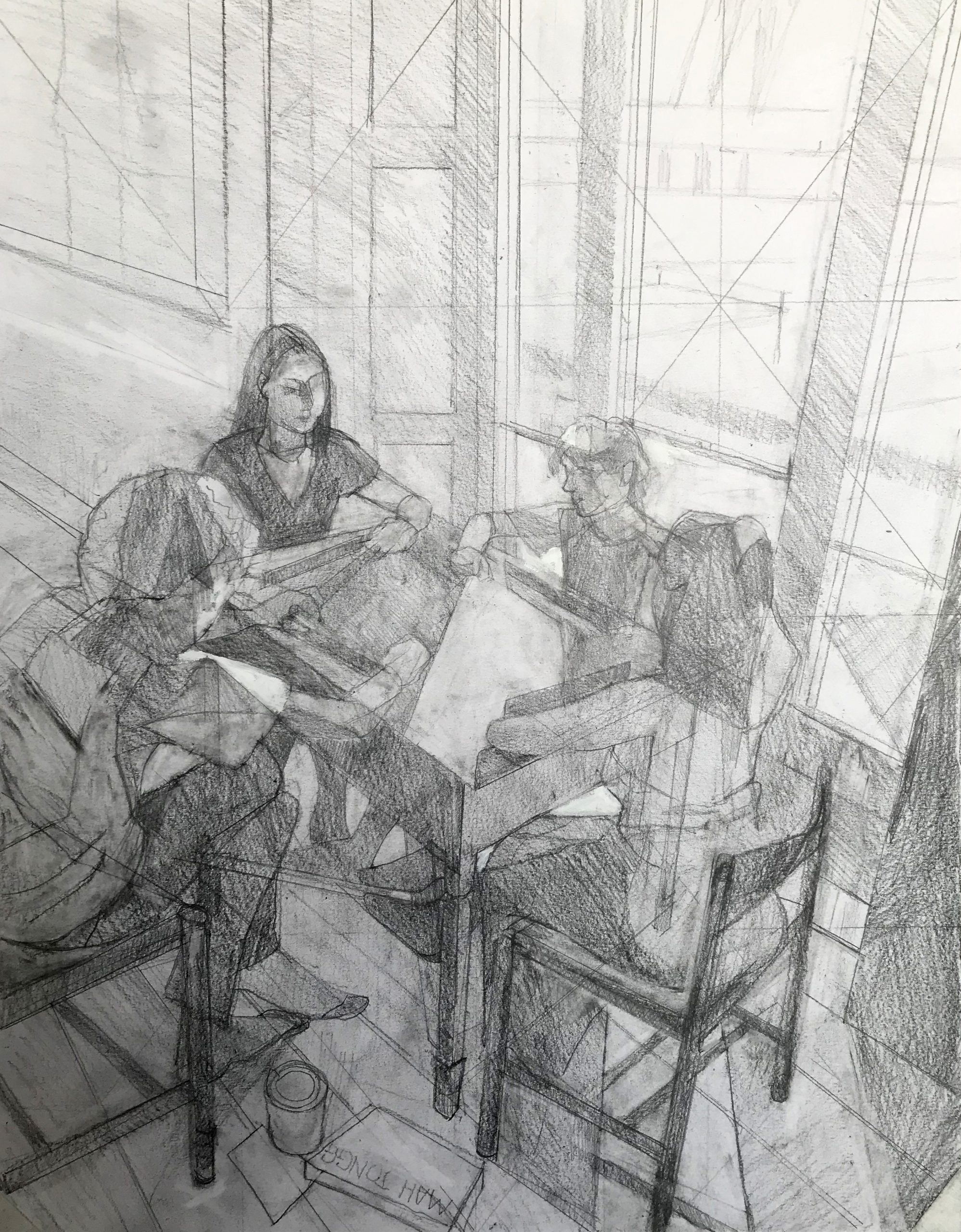
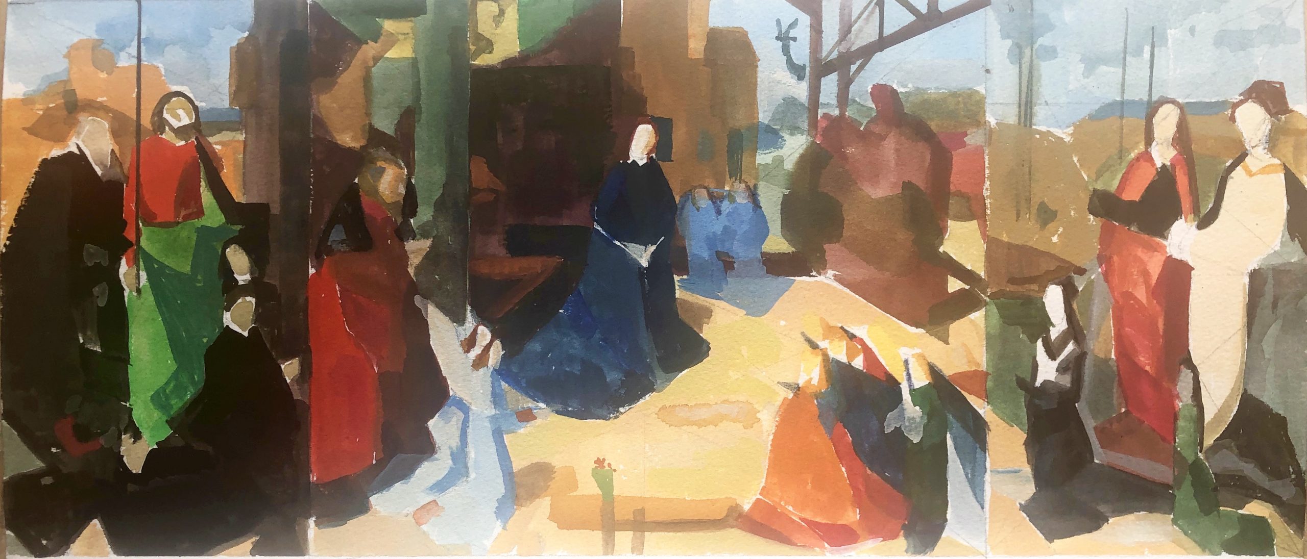
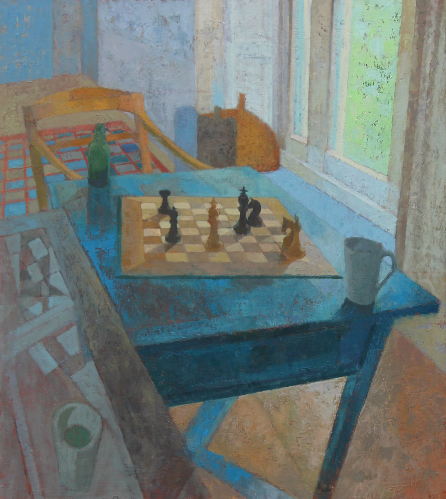
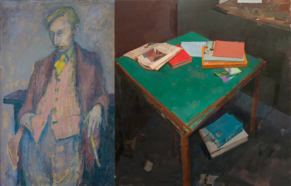
This drawing from a life class that I go to regularly is the kind of tonal approach that I can use as a starting point for a painting.


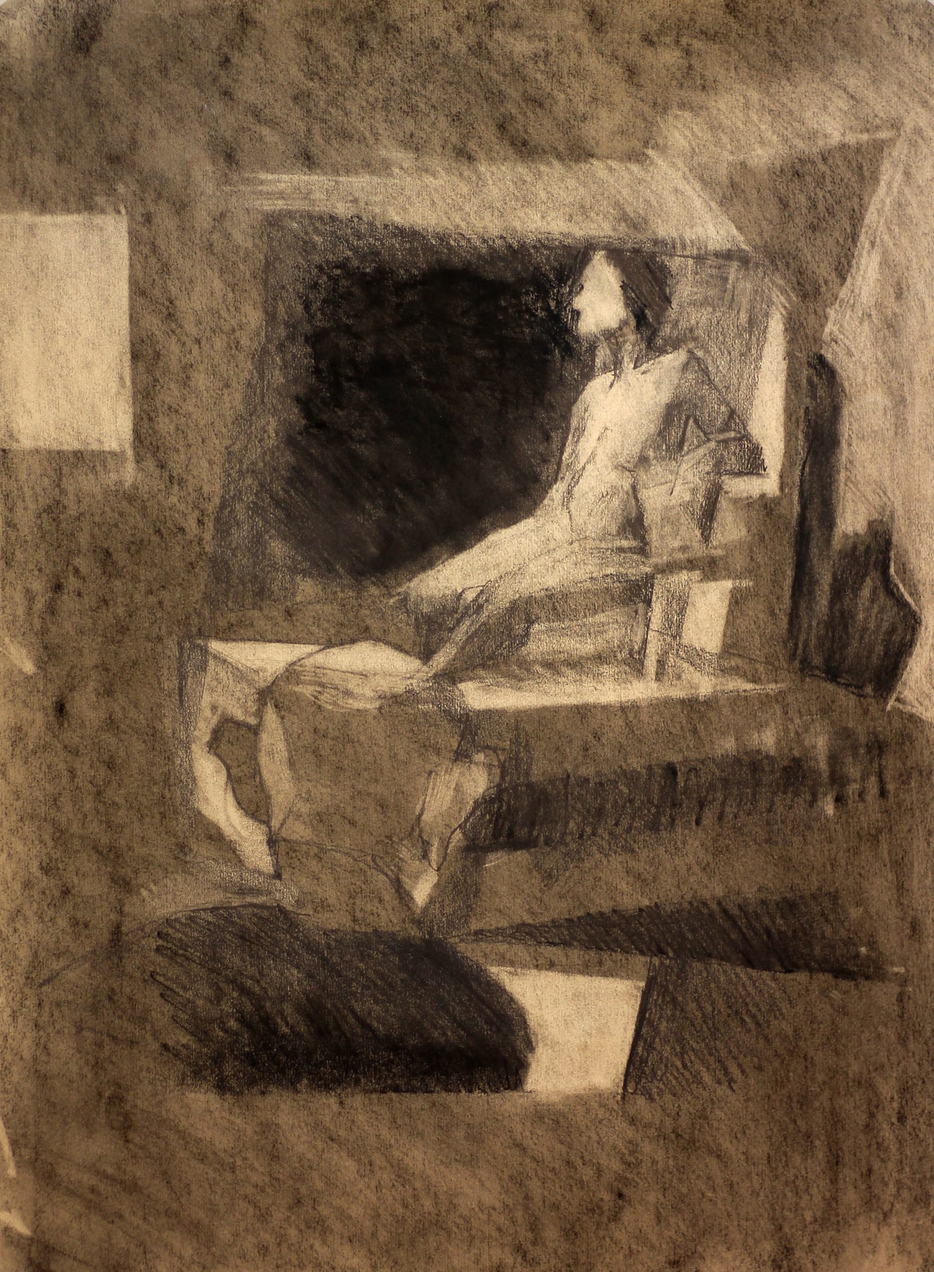
Thinking a little about contours and edges: I find a drawing always benefits when I stop thinking in terms of labels: mouth, eyeball, etc and instead think in an abstract way: negative shapes, contours turning into inside edges, making sense of a contour by following internal structure -that sort of thing.

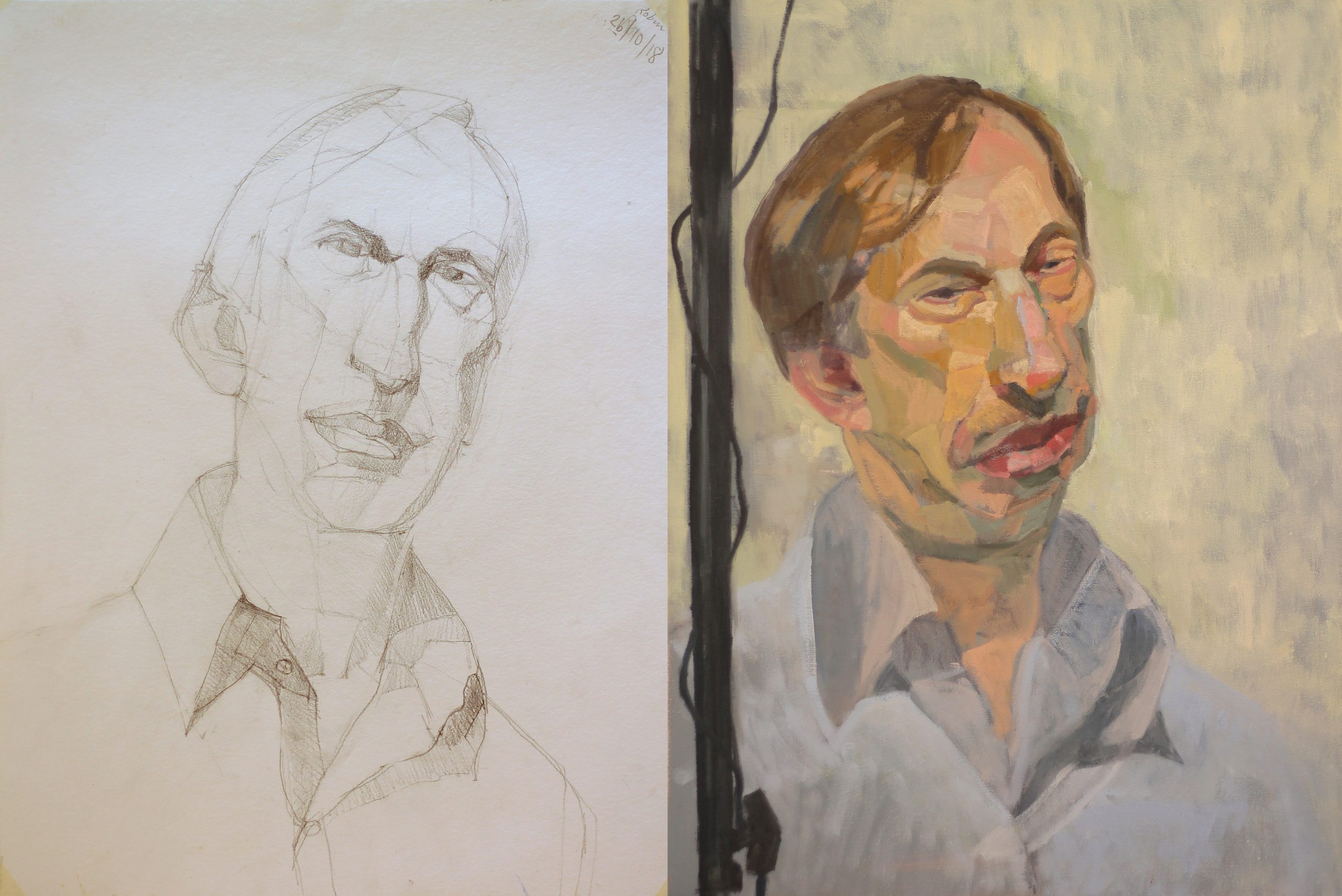
This portrait drawing I hope demonstrates this sort of approach. Although Robin’s pose changed between these two works, I found the painting much easier to tackle as I had already worked out what was going on with his unusual jaw and chin in the drawing.


I always try and make my drawings by as simple means as possible, I think big to small, and don’t worry about unnecessary detail. If the overall structure doesn’t work, no amount of clutter will cover that lack of understanding. I always have at the back of my mind: is this information essential to start a painting without direct reference to the subject?

Here’s a couple of stabs at capturing Alice that went badly wrong, I didn’t work out her proportions properly in the drawing, so when I started the painting later I got myself in a pickle over her arms and the twist in her torso. I’m still pondering what to do about this one as Alice has now returned to France.


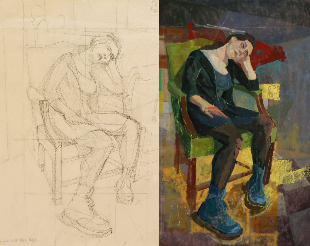
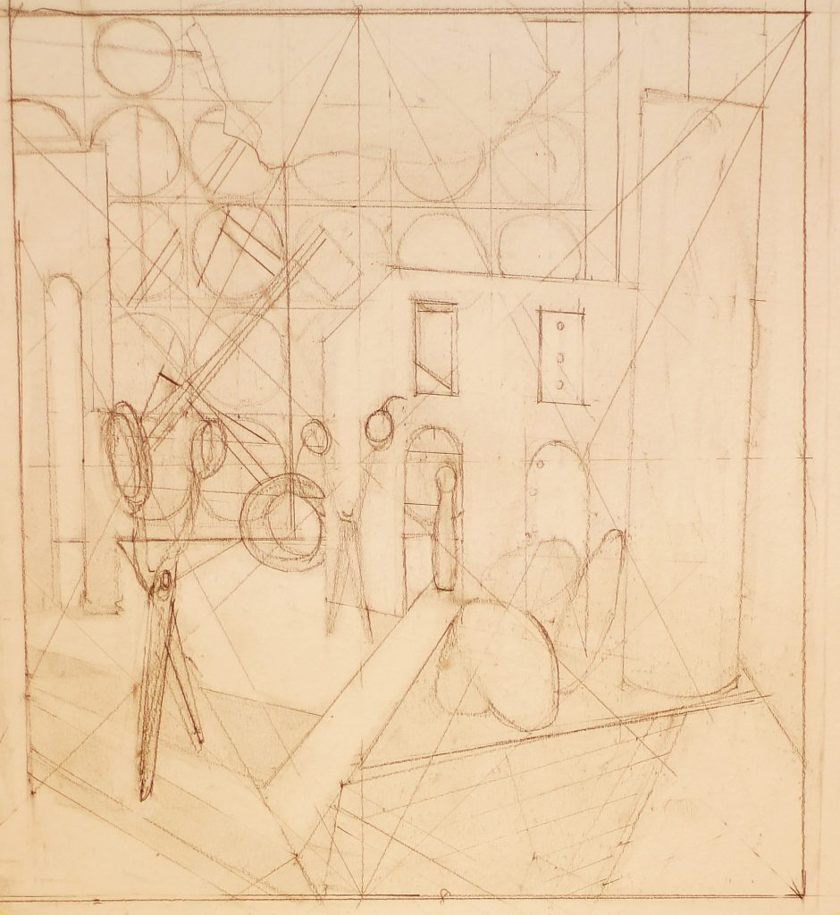
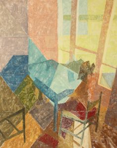
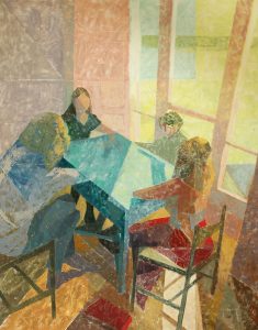
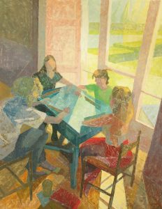
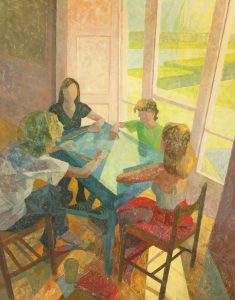
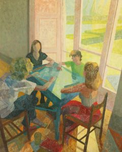
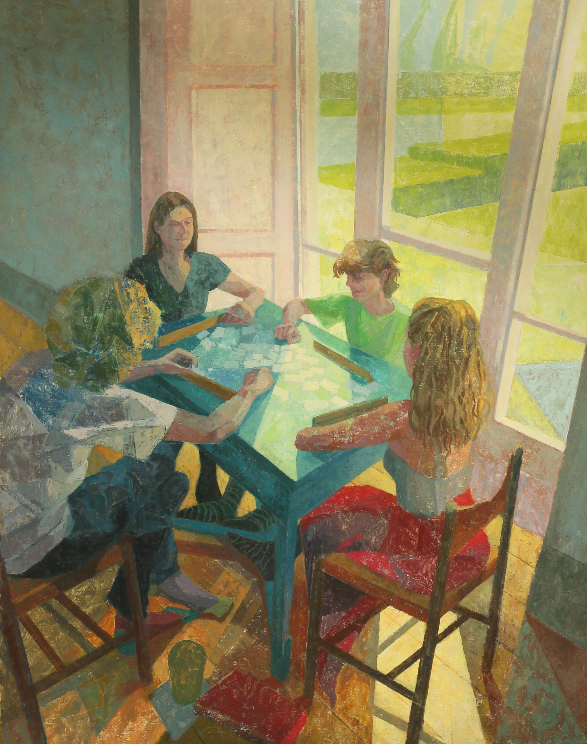
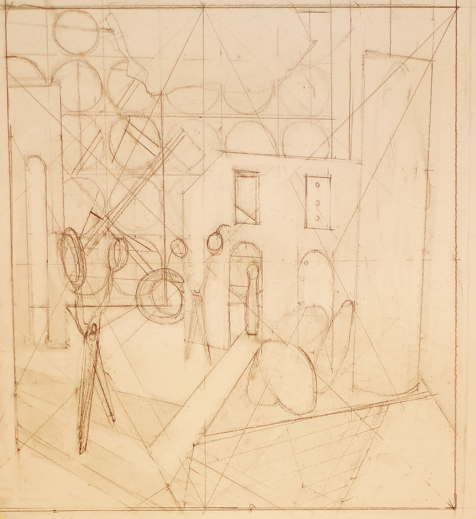
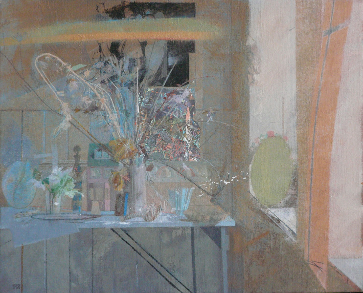
Finally here is the compositional drawing for ‘Rock Paper Scissors’, one of the paintings in this exhibition. I followed this drawing pretty closely in the painting as the work was all about clean crisp edges and the fall of light and on a much smaller scale than my normal work, so less room for manouvre.

Posted in Uncategorized | Leave a comment

Paul Nash’s Painting ‘On Menin Road’

Three things happened recently that have prompted me to write a blog piece after a long absence: I saw the Paul Nash exhibition in London, my son is reading Siegfried Sassoon’s war poetry at school, and Trump became the President Elect of the United States. What connects all three is Nash’s painting On Menin Road. It was painted at the end of the First World War as a commission for the British War Memorials Committee.

Nash was sent to the Western Front in early 1917, but was sent home from Ypres that summer after he broke a rib falling into a trench, and a few days later most of his former unit was killed in battle. He returned to Ypres in 1918, not as a soldier but as a war artist, and drew feverishly whilst in the trenches for the last few months of the war. These drawings were his raw material for His masterpiece On Menin Road.

It is a picture of the desolation and despair wrought by war on the landscape, and is almost unbearably moving as an image of the horror of war. Nash has made an extraordinary piece of visual poetry out of the meshing of his personal experience with the new visual language of Cubism and Vorticism that was developing at the time. It’s not often that you can hear the sound of a painting but the clouds from distant shell fire and the jagged shafts of sunlight conjure up the constant booming of explosions and shell fire that the soldiers had to endure. The harsh zigzag of the streams and road cutting across the landscape seem eerily prescient of the Nazi Swastika in the war to come, whilst the dissonant colours: ochre, cerulean, burnt orange, acid yellow, pinks and purples, and bleached out lighting encapsulate the bleakness of the ravaged landscape.

Bizarrely the reflecting shell craters full of acrid water remind me of another great painting with subject matter that could not be further removed from this desecration of the landscape, Piero’s Della Francesca’s Baptism of Christ with uncannily similar identical reflections and plants in the River Jordan by Christ’s feet. I wonder whether this was intended by Nash as a reminder of the complete absence of God in this hellish vision? As a pupil of Henry Tonks at the Slade he did study Piero closely, and was one of the five members of the Neo Primitives along with Stanley Spencer and others. He would have known Piero’s Baptism like the back of his hand.

Nash wrote a letter to his wife whilst drawing on the front describing the horror of the war which I quote below to give you a sense of the emotional and physical tumult that his masterpiece came out of:

‘I have just returned, last night from a visit to Brigade Headquarters up the line and I shall not forget it as long as I live. I have seen the most frightful nightmare of a country more conceived by Dante or Poe than by nature, unspeakable, utterly indescribable. In the fifteen drawings I have made I may give you some idea of its horror, but only being in it and of it can ever make you sensible of its dreadful nature and of what our men in France have to face. We all have a vague notion of the terrors of a battle, and can conjure up with the aid of some of the more inspired war correspondents and the pictures in the Daily Mirror some vision of battlefield; but no pen or drawing can convey this country—the normal setting of the battles taking place day and night, month after month. Evil and the incarnate fiend alone can be master of this war, and no glimmer of God’s hand is seen anywhere. Sunset and sunrise are blasphemous, they are mockeries to man, only the black rain out of the bruised and swollen clouds all though the bitter black night is fit atmosphere in such a land. The rain drives on, the stinking mud becomes more evilly yellow, the shell holes fill up with green-white water, the roads and tracks are covered in inches of slime, the black dying trees ooze and sweat and the shells never cease. They alone plunge overhead, tearing away the rotting tree stumps, breaking the plank roads, striking down horses and mules, annihilating, maiming, maddening, they plunge into the grave, and cast up on it the poor dead. It is unspeakable, godless, hopeless. I am no longer an artist interested and curious, I am a messenger who will bring back word from the men who are fighting to those who want the war to go on for ever. Feeble, inarticulate, will be my message, but it will have a bitter truth, and may it burn their lousy souls.’

In this new potentially isolationist, nationalist world order with Trump in charge, Nash’s extraordinarily powerful painting and writing provide a stark reminder of the endgame of similarly misguided policies one hundred short years ago.

Posted in Uncategorized | Leave a comment

Why I love Veronese – a recent NYAA essay

By the time you get to my age there have been a lot of painting loves, I am very torn between long term affairs and current crushes. A few contenders: Duccio’s jewel bright comic strip of the Passion of Christ, Piero Della Francesca’s Miracle of the True Cross cycle, Hugo van der Goes Portinari Altarpiece. Duccio is a bit early for this project, but I’d love to make a film about that epic work in my fantasy life with no time constraints. The difficulty with Piero is picking one of the many paintings in the cycle, and if I’m honest the story surrounding the Portinari Altarpiece is what moves me about that painting as much as the painting itself. So to the current crush: Veronese. Its been a long time in the making. San Sebastiano Church in the Dosoduro in Venice was my first brush with Veronese in volume, but getting your head around the pictures there is difficult. Lying on the floor, or putting lira coins in the machine for a three minute glimpse at the Altarpiece is not ideal, although the surroundings are glorious and it is an essential pilgrimage for Veronese lovers.

So to London’s National Gallery exhibition this spring where for the first time I was able to get the full house of this extraordinary painter shipped in from everywhere from the Met to The Prado. I couldn’t keep away, I knew his colour sense was good, but here was perfect pitch both chromatically and tonally time after time. His last ‘Venus, Mars and Cupid’ from Edinburgh has a passage of close toned footwork in the bottom left corner that made me cry more than once it is so exquisitely subtle. But I know I’m meant to chose a whole painting and not four intertwined feet so I’m plumping for ’Christ and the Centurion’, a mid career painting where his colour is still in full throttle before things became more somber and close toned in the last decade or so.

Christ And The CenturionFor me this painting works on every level, as a human drama, as a dynamic composition contained within a rigorous architecture, as a painting reveling in saturated colour in the foreground drama, fading into the gloriously simply suggested far distant dog walk. The pathos of the grand old general falling to his knees to beg Christ’s attention and the surprise and consternation of his minions are perfectly realized both in the expressiveness of the faces and also in the whirligig of arms, fabrics, lances, and legs that culminate in the general’s pleading right hand. Veronese’s use of negative space always delights, there is never a dull moment in them: lances against background rhyme with the young boy’s striped sleeve, gorgeous crimson cloaks billow through the columns and down through legs to the general, heads, hats and helmets appear in all sorts of unexpected places. I’m sure Veronese gets away with murder in terms of bodily construction at times but he covers it up so well with his sumptuous brocades, silks and armour that I can forgive him anything. The low vantage point and bluegreen sky against the buttercup yellows and scarlet pimpernel crimsons brings to mind a fanciful feeling of a worm’s eye view of a springtime alpine meadow strewn with intensely coloured flowers.

On formal composition, the stepping down of the background architecture repeats the whirligig going on in the foreground, the busyness stopping suddenly with the contrast of the general’s dark arm against the light, counterpoised by Christ’s highlighted arm against the dark. All this happens at about the golden section slice of the painting with Christ’s left hand on a level with the Centurion’s head. So the centre of the drama is actually a relatively empty space, the meeting of two worlds in the soldier and the bringer of peace. And in the middle is a man walking his dog! I’m still not sure what that’s about..

I visited the Prado for the first time this summer and my life long affair with Italians was blown out of the water when first coming face to face with Velasquez. That’s a whole other story to tell, but one thing that struck me forcibly was how similar some of his spatial arrangements are to Veronese, for example ‘The Surrender at Breda’ could almost be Veronese’s battle painting. Wondering around I discovered several Veronese paintings that had been bought back to Spain by Velasquez from his Italian travels for his own collection.

I’m starting to veer off topic but just one more thing on my painting, the way the man handles paint. He does it with a confidence, almost a swagger that to me is completely virtuoso. Its intoxicating nearly five hundred years on, the effect on a contemporary viewer must have been astounding. Here almost for the first time (I’m lumping him together with Titian and Tintoretto here) is a painter showing his love for the stuff of paint as well as all other sumptuous stuff he surrounds himself with.

Posted in Uncategorized | Leave a comment

Still Alive Exhibition at the Mall Galleries

I have three pictures in an the exhibition ‘Still ALive’ at the Mall Galleries that opened this week. it is a small exhibition in the Threadneedle Space of twenty or so painters showing a very varied approach to the Still Life genre, and contains some real delights including a large Arthur Neal entitled ‘Studio’. Each exhibitor had to write a short piece on why they paint Still Life paintings, my contribution is below along with the pictures I am exhibiting.

Three Points Of View

The answer for me to the question ‘why paint still life?’ Is the same as to why paint at all – it’s all about trying to recapture and understand the excitement of the first moment of seeing the image.

With still life this sometimes takes the form of a conscious construction, as in ‘Three Points of View’. In this painting I wanted to play with the distortion and abstraction mirrors made of the gorgeous Veronese pink and greens of the various circular objects I had assembled.  At other times it is a fleeting image that cries out to be caught and made permanent, sunlight falling on my daughters primrose yellow Doc Martens is that kind of image.

White 517

The Yellow Boots

Posted in Uncategorized | Leave a comment

Duccio’s Passion for Colour

Duccio’s Passion of Christ- a painter’s pespective

More Traveller’s Tales:-I revisited an old friend in Siena this summer, one I had met many times before but this time we managed a quiet hour together instead of a rushed conversation in a crowd. The friend in question is Duccio’s Maesta, specifically the Passion of Christ on the back of the Altarpiece. It was painted to be seen up close by the clergy and others with privileged access behind the altar in the Siena Duomo and tells the story of Christ’s last week on earth. This reproduction does no justice at all to the real thing which measures a magnificent fifteen foot across and a similar height when fully reassembled. 

It reads like a book for an audience that read in images rather than words, but unlike a book starts from the bottom and works up towards heaven. It was made almost exactly 700 years ago and to my mind has never been equaled since in the subtlety, sophistication and perfection achieved in the synthesis of abstract design and narrative that Duccio masterminded. Although each of the 26 panels can be read as a beautiful unique painting it is in the connections, repetitions, echoes, and rhythms between the panels that the work as a whole is so utterly compelling.

The ancient comic strip opens bottom left with a double image Entry into Jerusalem, a capital letter to start things off as would happen in a medieval manuscript. It reads towards the top right where Christ is on another road just before entering Emmaus where he leaves this world for the final time. Throughout the panels a strong diagonal movement from bottom left to top right takes place in terms of the architectural and landscape structures and consistent lighting sources through the panels, all of which lead one’s eye to Christ’s departure from this world in the final panel.

The dominant colours throughout the panels are gold and red in all its guises: scarlet, vermillion, cadmium, burnt sienna, hot pink, the colour of the Passion and of Christ’s blood.

The use of background colour as a secondary theme establishes chapters in the story. They move from cool greens in the first quadrant where Christ is surrounded by his disciples, moving to pale cream fading to umber backgrounds for the betrayal and denials, building up through a frenzy of crowds where the background colours get hotter and more agitated, culminating in the large Crucifixion scene where the unruly aggressive gang of soldiers to the right of Christ seem to be drowning in a river of scarlet blood flowing from the crucifix above. After the Crucifixion the crowds melt away, the scenes empty out and fade to gold for final days between the Resurrection and the Ascension into Heaven.

 Duccio allows one to follow each character through the entire altarpiece by following colour even if one is too far away to read faces. Wonderful touches include Christ’s and Mary’s colours of blue and red being a mirror image of Pontius Pilate, the clash of reds that takes place between Christ’s and Judas’ cloaks in the betrayal, and Christ’s cloak taking on a golden shimmer after he is risen from his tomb.   

Then there are the echoes that occur throughout the panels. Examples include those between the three crosses in the Crucifixion with the tree groupings below and the columns of the Pontius Pilate scenes, the subtle leading of the eye along the panels as one is led from for example the Betrayal by the disciples hurrying out to the right of the panel into the next one through the archway into Christ appearing before Annas, or the maidservant’s arm pointing to Peter by the fire but also to him in all three Denials, or the arches on the left of the Denials being repeated above in the Harrowing.

I could go on endlessly but I’m sure you get the drift of the complexity and marvelous subtleties of the Passion as a whole. I would just love to see the whole altarpiece reunited, reassembled and back on the high altar in the Duomo. Sadly that will never happen as key panels have been lost and a few others have traveled far from Siena. The Passion, the Maesta and the other panels still in Siena are now in the Duomo Museum. What one can ascertain however is that the wonderful colour accents and themes continue throughout the Altarpiece. The dominant reds of the Passion fade into creams and golds as one’s eye travels up and down the back of the Altarpiece from the Last Days of the Virgin to the scenes from the Life of Christ, but I do wonder what colour dominated the now lost Ascension into Heaven at the pinnacle of the Altarpiece.

Posted in Uncategorized | Leave a comment

The NEAC hanging and Annual Exhibition opening

This was originally posted last December on the NEAC blog

What a busy week for the NEAC! I’ll start at the end with a delightful opening ceremony at the private view that had the youngest member (bar one) Alex Fowler honouring the oldest member (bar none) Margaret Thomas. They both made splendid speeches and Margaret captured the sea of beaming faces with a very modern looking camera whilst making her speech.

Margaret is ninety five, she first exhibited with the New English in 1933 at the age of seventeen, was elected to membership in 1947 and has exhibited every year since. There is a tribute wall to her in this year’s exhibition with a selection of wonderful paintings spanning her long and successful painting life. Below is a painting from her wall together with a painting of the second youngest member Alex Fowler. There may be nearly sixty years separating them, but both painters clearly share the ethos of sensitive, thoughtful observational painting that is at the heart of the NEAC’s membership. They also look like they were having a great time together at the party.

Kyffin Williams by Margaret Thomas                            Books on a Table by Alex Fowler

Margaret and Alex's pictures

party


Margaret and Alex at the party


The exhibition looks glorious, but it was a different story first thing Monday morning. I missed the hardest part of the decision making early in the morning, as my train was once again bogged down by floods in the west country. By the time I arrived the hanging committee and the hanging team had laid out 400 plus paintings on the main gallery floor and started to assemble them into hanging groups.

Larger contemporary works headed off to the new Threadneedle Space, smaller works went to the North Galleries, which left a mere few hundred (or so it seemed) to hang in the Main Gallery. How it was all hung by Tuesday is both a mystery and a miracle and I was there! I imagine the process of editing a national newspaper is similar: some journalists whisper, some shout, but they all want to be heard and are jostling for space against a scarily tight deadline. The editor in chief Richard Pikesley let all his journalists and subs have their say and the newspaper hit the presses on time.

the Hanging dayIt looks sensational. There are a lot of big ambitious works to see this year, and drawings and prints have been hung with paintings for the first time in a while to provide some interesting juxtapositions.The Hanging Day

A wise painting friend once said to me that you that could always tell a great painter as they make you look at the world through their eyes and see things you would not otherwise see. As I left London early Friday morning after a great private view party, I suddenly spotted a pure Paul Newland painting come to life. It was there in the glimpse of a fairground and ferris wheel through the trees in the pale morning light across the frosted green grass of Hyde Park, bright lozenges of colour against pearly grey morning light, with silverpoint sharp drawing.  Here is another of Paul’s paintings that is in the exhibition. Come and see this and many other very individual visions of our world for yourselves throughout  this week at the Mall Galleries.

That Time of Year by Paul Newland

That Time of Year Paul Newland

Posted in Uncategorized | Leave a comment

Seven Young Men in Venice

This was originally posted in November 2012 on the NEAC Blog.

We took my in laws to Venice this week to celebrate my father in law’s eightieth birthday. The tourists had fled the floods and the rain and left Venice to the Venetians, most of whom were old and in furs so the city was quiet and slightly forlorn. I did come across seven beautiful young men as we meandered however, all called Sebastian and mostly Venetian, although one was passing through en route to Mantua. The line up tells one more about the development of the venetian renaissance than pages of writing can, have a look for yourself..


J Bellini            Murano          Giovanni Bellini     Andrea Vecchio          Palma  Vecchio          Veronese               Tintoretto

 1464                  1478               1468                         1506                               1524                             1564                        1587

 A few things struck me about the gang of youths: firstly how Saint Sebastian packed on the pounds over the period. He starts looking positively skinny, is pretty perfect by the time Giovanni Bellini portrays him, but is building up the muscle, more VeniceBeach than Venice, with Veronese and Tintoretto. To me the first three paintings are all about the drawing, but colour takes precedence in the final three. The pose also becomes progressively more dramatic, anguished and contorted, and by Tintoretto’s image poor old Sebastian is being skewered on the altar of mannerism.

Lastly it struck me that, rather like Venice itself, what a close knit claustrophobic world venetian painting circles must have been. Jacobo was father to Giovanni and Gentile Bellini, father in law to Mantegna, who married Giovanni and Gentile’s sister Nicolosia, Giovanni taught Titian and Giorgione, Andrea da Murano imitated Giovanni, Titian briefly taught Tintoretto, Tintoretto and Veronese were arch rivals on  several big commissions, Palma Vecchio trained Boniface Veronese who trained Tintoretto after he fell out with Titian. I wish someone would make a painters tree out of the tangle of connections…


Posted in Uncategorized | Leave a comment